The Silent Language of Color
Color is an artist’s superpower—a way to whisper, shout, or soothe without words. It shapes how we feel, from the jolt of a red stop sign to the calm of a blue horizon. In 2025, as artists refine their craft, understanding the psychology of color in art offers a way to connect more deeply with viewers. This isn’t just about aesthetics; it’s about intention—knowing why a hue stirs joy or unease and using it deliberately.
Conventional color theory gives us the basics: primary, secondary, and tertiary hues, their temperatures, and how they harmonize or clash.
Yet, there’s more to explore. Chögyam Trungpa, a Tibetan teacher and artist, saw color as a reflection of human experience—energy, space, richness—not just pigment on a canvas. His ideas, drawn from decades of teaching in the West, add depth to traditional theory without requiring a meditation cushion. By blending these perspectives, we can learn how to evoke emotion with color in ways that resonate universally. Let’s dive into five key colors—red, blue, yellow, green, and purple—and see how they work in art, merging science with a touch of Trungpa’s wisdom.
1. Red: The Pulse of Intensity
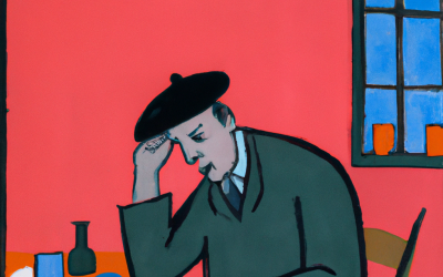
In color theory, red is a primary powerhouse—warm, vibrant, and impossible to ignore. Psychologically, it’s a stimulant: studies show it raises heart rates and signals urgency or passion. Think of Picasso’s Guernica, where red accents amplify the chaos, or Matisse’s The Red Studio, radiating bold energy. It’s the go-to for drawing eyes to a focal point or heating up a composition. But overdo it, and it risks feeling aggressive—balance is key.
Trungpa saw red as a burst of clarity—a wake-up call cutting through distraction. He linked it to precision and strength, though he noted it can tip into restlessness if unchecked. This aligns with color theory’s view of red as dynamic: pair it with cool blues or soft grays to temper its fire, or let it dominate for raw impact. For artists, red might highlight a figure’s intensity or underscore a dramatic moment. Try a crimson slash across a muted background—it’s like a visual exclamation point. Experiment with shades: a soft coral for warmth, a deep burgundy for tension. Red’s strength lies in its ability to provoke, so wield it with purpose.
Practical Tip: Test red in small doses on a sketch. Does it pull focus where you want? Adjust its neighbors to control the mood.
2. Blue: The Depth of Calm
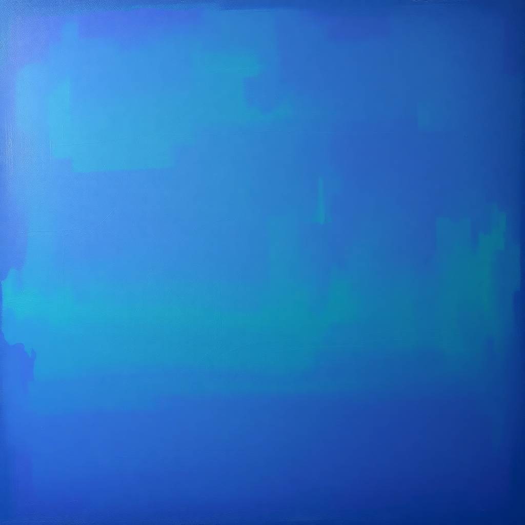
Blue, another primary, sits on the cool end of the spectrum, soothing and expansive. Research shows it lowers blood pressure, evoking trust and peace—think of Monet’s serene water lilies or Yves Klein’s immersive IKB. It’s versatile: pale blues lift, deep navies introspect. Traditional theory pairs it with oranges for contrast, but alone, it can feel distant or melancholic.
Trungpa viewed blue as spaciousness—an open invitation to pause and reflect. He saw it as a canvas of potential, though it could drift into inertia. This echoes blue’s psychological role as a retreat: it’s calming but needs warmth to stay engaging. Use it for tranquil landscapes or quiet portraits—layer cerulean over cobalt for depth, or add a yellow highlight to spark life. In abstract work, blue can stretch the viewer’s gaze, suggesting infinity. It’s less about action and more about being, a hue that asks us to linger.
Practical Tip: Paint a blue gradient, then add a warm accent. Notice how it shifts from cold isolation to gentle welcome.
3. Yellow: The Glow of Optimism
Yellow, the third primary, is pure sunshine—warm, bright, and uplifting. Psychologically, it boosts mood and creativity, though too much can strain the eyes (think caution tape). Van Gogh’s Sunflowers glows with its cheer, but his heavy use also hints at unease. Color theory calls it tricky—vibrant yet unstable, best tempered with neutrals or greens.
Trungpa tied yellow to richness—a generous, expansive quality that fills space with worth. He cautioned against overindulgence, mirroring yellow’s tendency to overwhelm. It’s ideal for playful pieces or to spotlight joy—dab it on a flower’s center or flood a canvas with lemon hues. Softer ochres ground it, while bold golds amplify its radiance. Yellow invites energy, but restraint keeps it from shouting too loud.
Practical Tip: Mix yellow with gray or green on a test swatch. See how it softens without losing its lift.
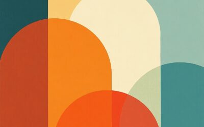
4. Orange: The Spark of Vitality
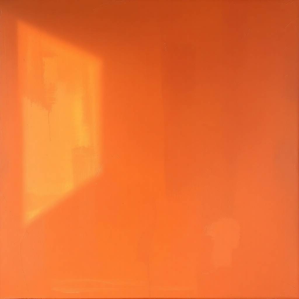
Orange, a secondary born of red and yellow, bursts with warmth and enthusiasm. Psychologically, it’s energizing—less intense than red, more grounded than yellow. It evokes sociability and play, seen in Gauguin’s tropical scenes or Hockney’s bright pools. Color theory marks it as a unifier, bridging warm tones, though it can feel loud if unchecked—blues or greens tame it.
Trungpa didn’t assign orange a distinct role, but his view of red’s energy and yellow’s richness suggests a lively blend—a spark of connection and joy, with a risk of overexcitement. Use it for vibrant sunsets or a pop in abstracts—tangerine for cheer, rust for depth. It’s less about subtlety and more about life, waking up a composition without dominating. Soften with neutrals or pair with blue for electric contrast.
Practical Tip: Dab orange on a test piece. Does it energize or clash? Adjust its intensity.
5. Green: The Harmony of Balance
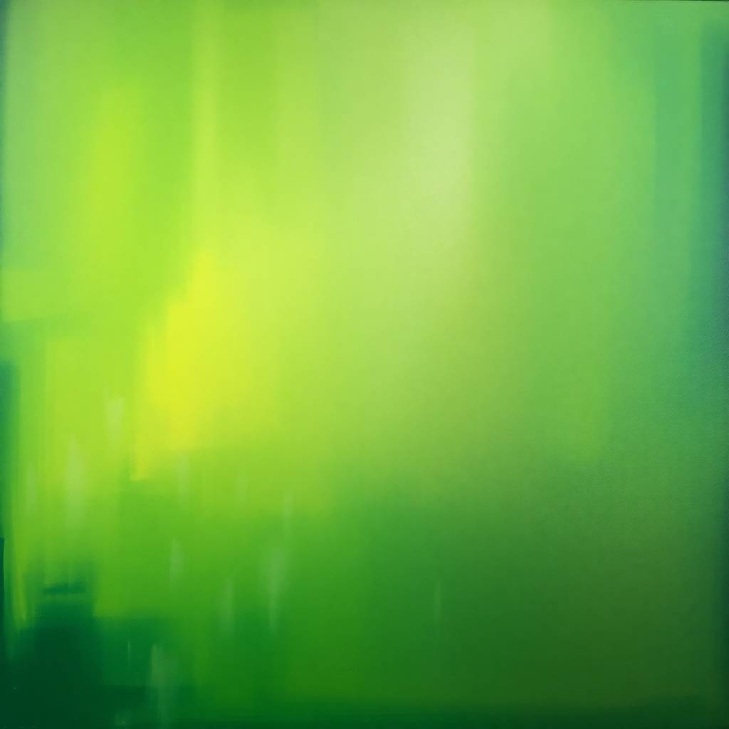
Green, a secondary born of blue and yellow, is nature’s mediator—restful yet alive. Studies link it to relaxation and growth, a staple in landscapes from Constable to O’Keeffe. Theory places it mid-spectrum, versatile with warm or cool companions. It can soothe or invigorate, depending on its shade.
Trungpa saw green as movement—a flowing energy that gets things done. He noted its potential for jealousy, akin to green’s psychological edge. Use it to anchor a scene—olive for earthy calm, lime for a lively twist. Pair it with red for tension or purple for mystery. In mixed media, green textured layers suggest renewal. It’s a bridge between extremes, offering stability with a pulse.
Practical Tip: Blend green with its neighbors on the wheel. Does it feel grounded or restless? Adjust accordingly.
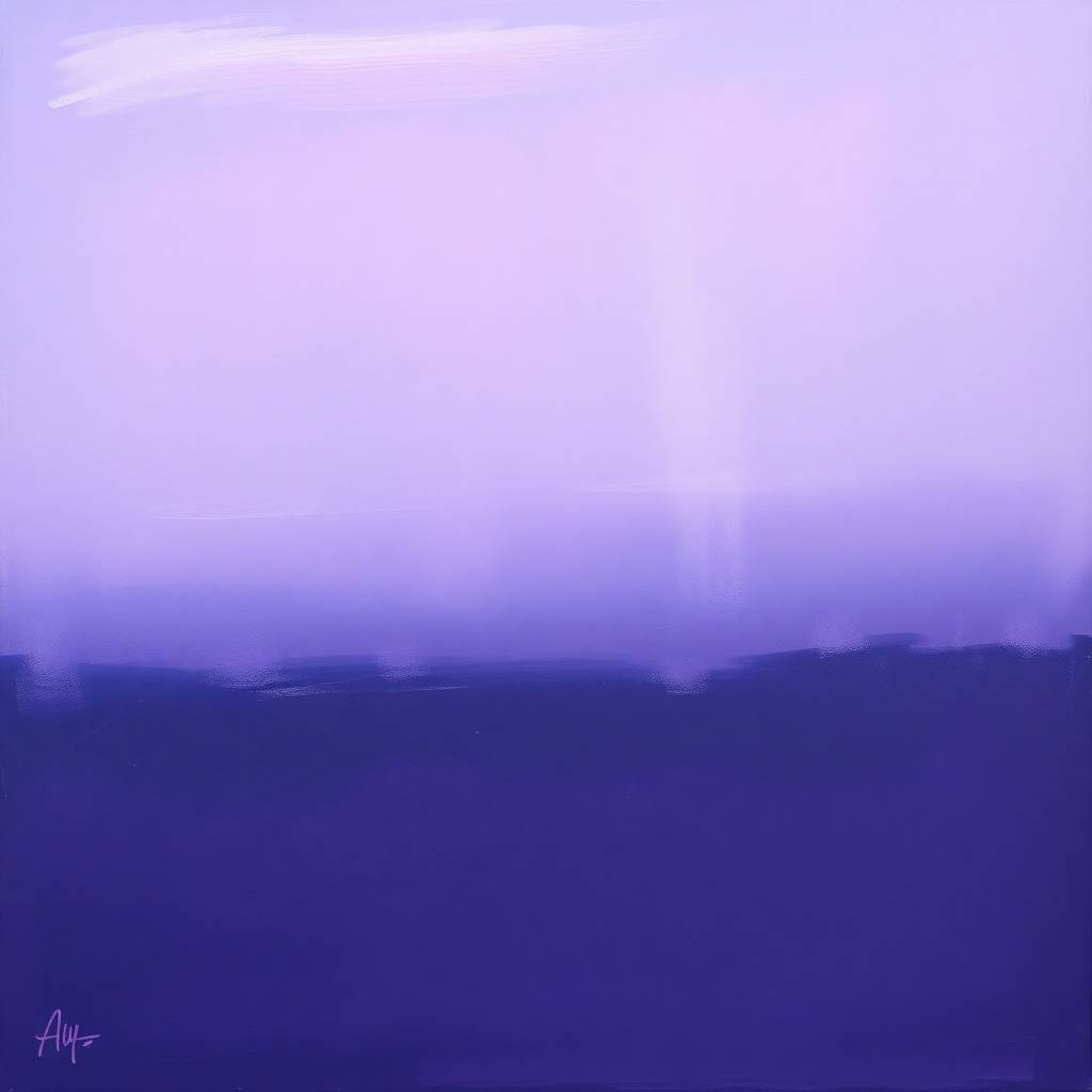
6. Purple: The Veil of Intrigue
Purple, a secondary from red and blue, carries a rare allure—luxurious, mysterious, creative. Psychologically, it’s tied to imagination and spirituality—think of Klimt’s shimmering robes. Theory marks it as complex, blending warm and cool, often paired with yellows for pop. Too much can feel heavy, but in moderation, it enchants.
Trungpa linked purple to a magnetic pull—passionate yet discerning, though it risks obsession. This fits its role as a dreamer’s hue: soft lilacs for whimsy, deep plums for drama. Use it in surreal works or to cloak a figure in enigma—blend with grays to ground it. Purple draws viewers in, a quiet call to explore.
Practical Tip: Layer purple over a neutral base. Does it intrigue or overpower? Tweak its saturation.
Crafting Emotional Resonance
Color in art is both science and soul—psychology tells us how it moves us, theory shows us how it fits, and voices like Trungpa’s remind us it reflects who we are. Red energizes, blue calms, yellow lifts, green balances, purple captivates—each hue a tool to evoke emotion with precision. Blend these ideas in your palette: let red clarify a moment, blue open a space, yellow share its warmth, green keep it flowing, and purple spark wonder. Art thrives on feeling, and color is your voice. Test these hues, trust your instincts, and watch your work speak.

